Asian Reflection on the Vineyard
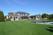
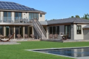
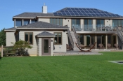
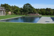
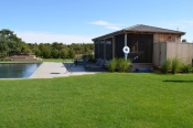
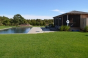
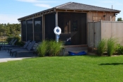
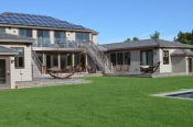
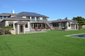
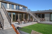
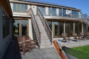
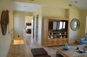
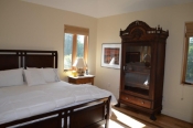
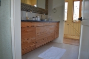
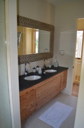
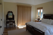
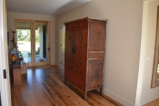
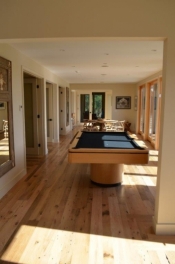
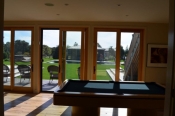
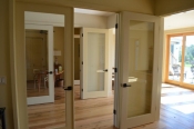
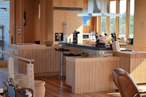 This job was one of the most interesting jobs that I have ever been involved in. I have worked with this client a few times before on some investment homes on the Vineyard, so I understood her style and taste. But she was struggling with the theme of this home, so on my visit to measure the areas, after framing was done, I was able to get a theme going for her. I have included pictures of the day I measured, and after photos of the whole home, inside and out to give a feel for the size of the project and how magnificent this home is.
My client has a very creative personality, and when I worked on her first home years ago, I went through the normal Dream First concept to get her style and taste out in the open. As soon as I walked into this home, with the hotel-like front of the home and the roof decks that were going to be outdoor gardens, Asian was the first word that came out of my mouth. I remember her words after I said that, “that’s it!’ As you can see, the kitchen is on the 2nd floor and it is one, large area that is home to the kitchen, dining area, casual area and living area. A very large area to fill, and it needed to jive with the space and look of the rest of the house.
Development of the island was very interesting. She wanted it to feel like it was going in all directions and to look like some of it was suspending off the floor, floating in midair with multiple materials, heights and counter surfaces. Again, I understood her taste so her request did not seem odd to me. The concept for the island was to have two work areas so the L-shape design was born. To give the kitchen that Asian feel, we mixed a few different recycled veneer materials in a very Asian, simplified door style. It fit in well with the wood and wired stairway. She wanted a very built-in sink look so we combined the quartz with some beautiful Blanco stone sinks. Clean cut and natural is how she wanted the tops to look.
The overall look with the different veneer materials and different quartz counter top colors really came together and grounded the design and look for the open space. It’s not a common look but it really complimented the wood and wire stairway and the wood covered floors, walls and ceiling. The gourmet appliances compliment the sleek, European look and the outdoor roof gardens.
We chose Ultracraft cabinetry throughout the home in their Slab door style. Caesarstone quartz was used on the counters in a few colors that gave the room a natural stone look.
All parties were pleased with the end results and as you will see by all of the pictures, the home and pool house are absolutely stunning! Enjoy!
Bon Appetit!
Tim Holick (Food A Holick)

