Tuscan Charm
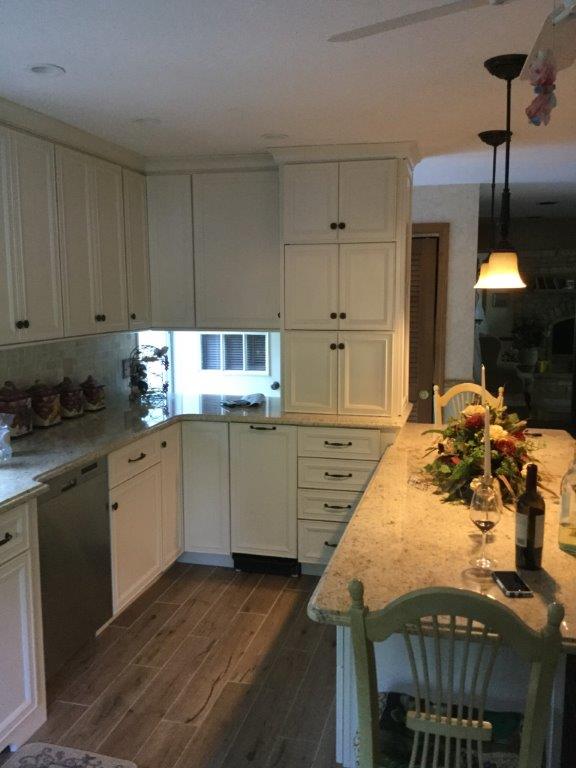 Every once in a while, I get called into an older, outdated kitchen to only bring it up-to-date in looks. The layout works for them but they really want to update the look. This month’s feature was just that. The kitchen was original when the home was built and they housed the cabinets that were hot at the time, laminate with the oak wood accent. I can remember selling this look so much back in the 80’s. It was a very clean, modern look at the time that brightened up the room. Not so much anymore. My client had been upgrading a lot between painting and doing floors over in the home, so now was the time when the kitchen was going to get a face-lift.
My clients have a Tuscan flare to their taste, so this is where we started with choosing the look for the room. Tuscan is a popular look for that cozy, old world charm. Detail and soft, painted colors fit the bill. Rustic looking walls also fit nicely into this look and they had already started painting a lot of the other rooms in that Venetian, plaster-look. Again, it gives the space that old world charm
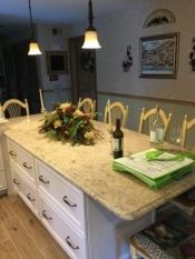
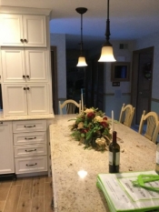
The layout wasn’t really changing, like I said, so the decisions mainly went into the door style and color. We stuck to the old plan but made the cabinet storage efficient and did things like bumping the sink base out to not only give them a break-front look but also giving more room for the faucets and cleaning around them. We also brought some of the cabinets to the counter in the peninsula area for more storage and giving the space a more custom, built-in look.
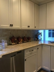
To give the room the look they sought, Omega’s, Dynasty series Salona door style was chosen. This door lends that recessed panel look that is popular but gives some nice detail to the outside framing of the door. They wanted paint but didn’t want anything too white, which would give the room a cold look. Omega makes a wonderful color called Oyster that fit into the scheme of her color palette. They also chose a very warm, exotic color for the granite counter tops that warms up the cabinetry but still gives that subtle, rich look. The hardware was an oil-rubbed bronze, which really warmed up the cabinetry.
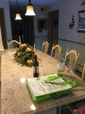
I added a nice arched curve to the lowered, table height area counter to give it a custom look and to give them a little more working space. Beautiful door panels were placed under the table area and the back of the peninsula cabinets. Like I said, detail is a big part of the Tuscan look but not an over-the-top feeling. The overall look and feel of the kitchen is exactly what they were looking for.
Thanks to the Dream First process, everything that they had been dreaming of came to fruition. Now when they entertain or cook, they can be proud of the space they chose and enjoy their updated room for many years to come!
Bon Apetit!
Tim Holick (Food A Holick)
Before Photos:
no images were found
After:
This entry was posted in Kitchen Remodeling on .

